Fongo
Project
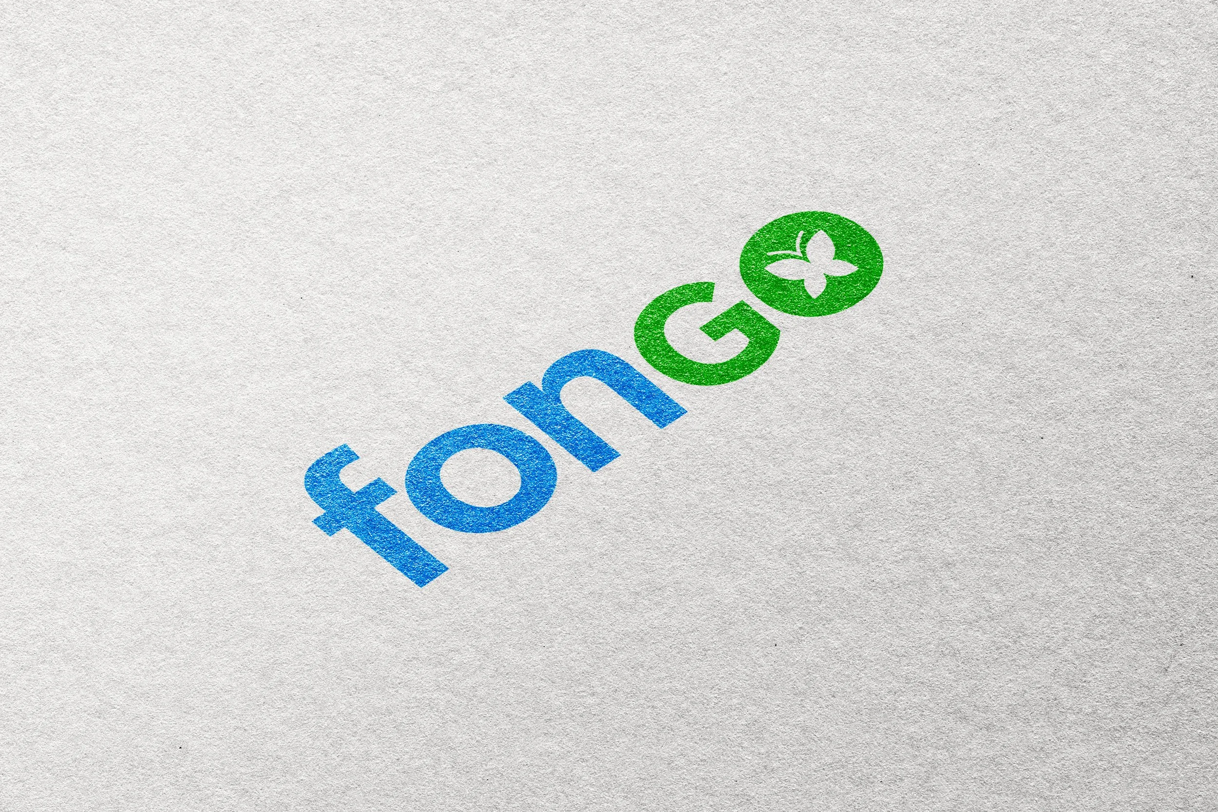
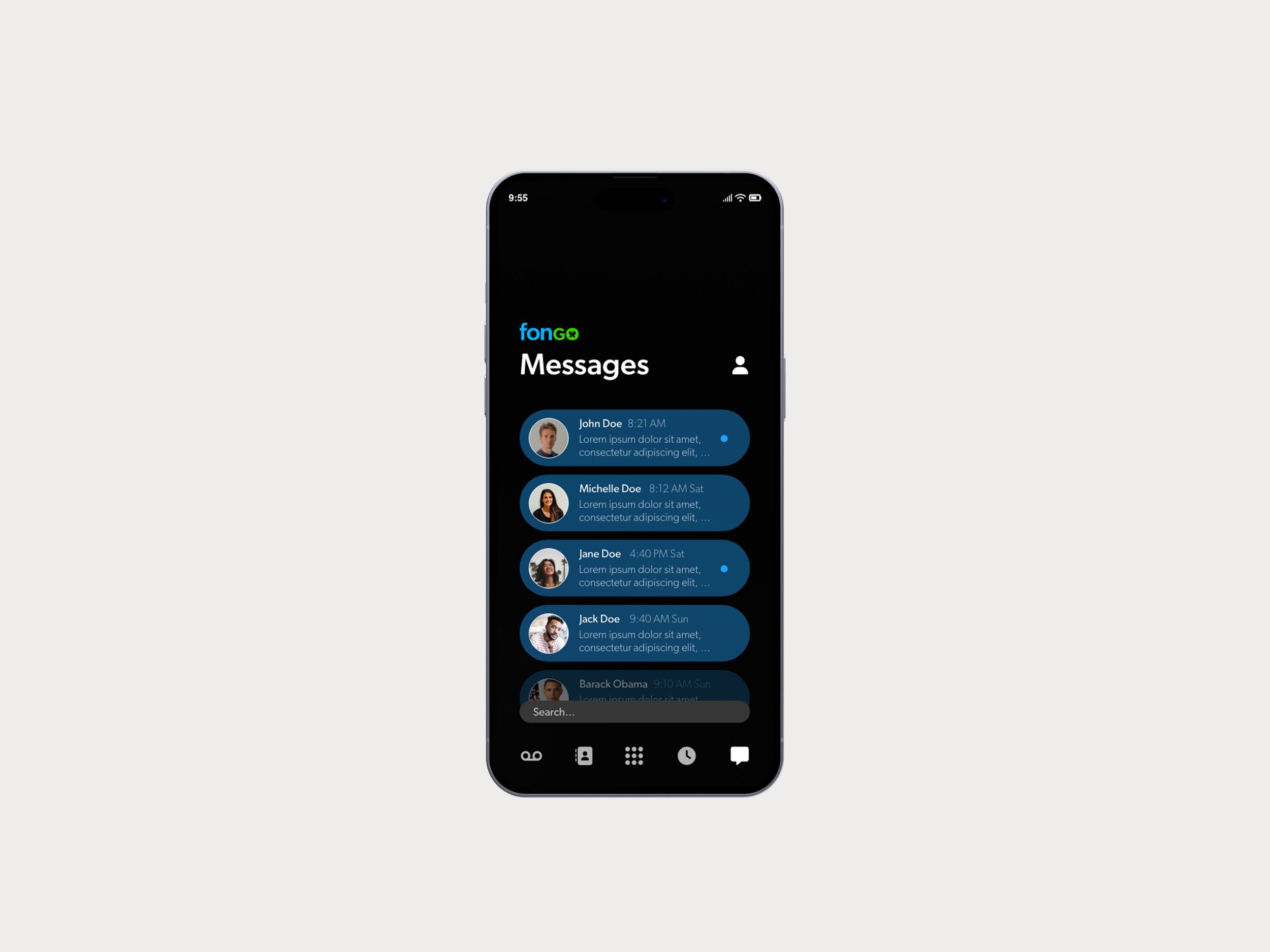
Fongo
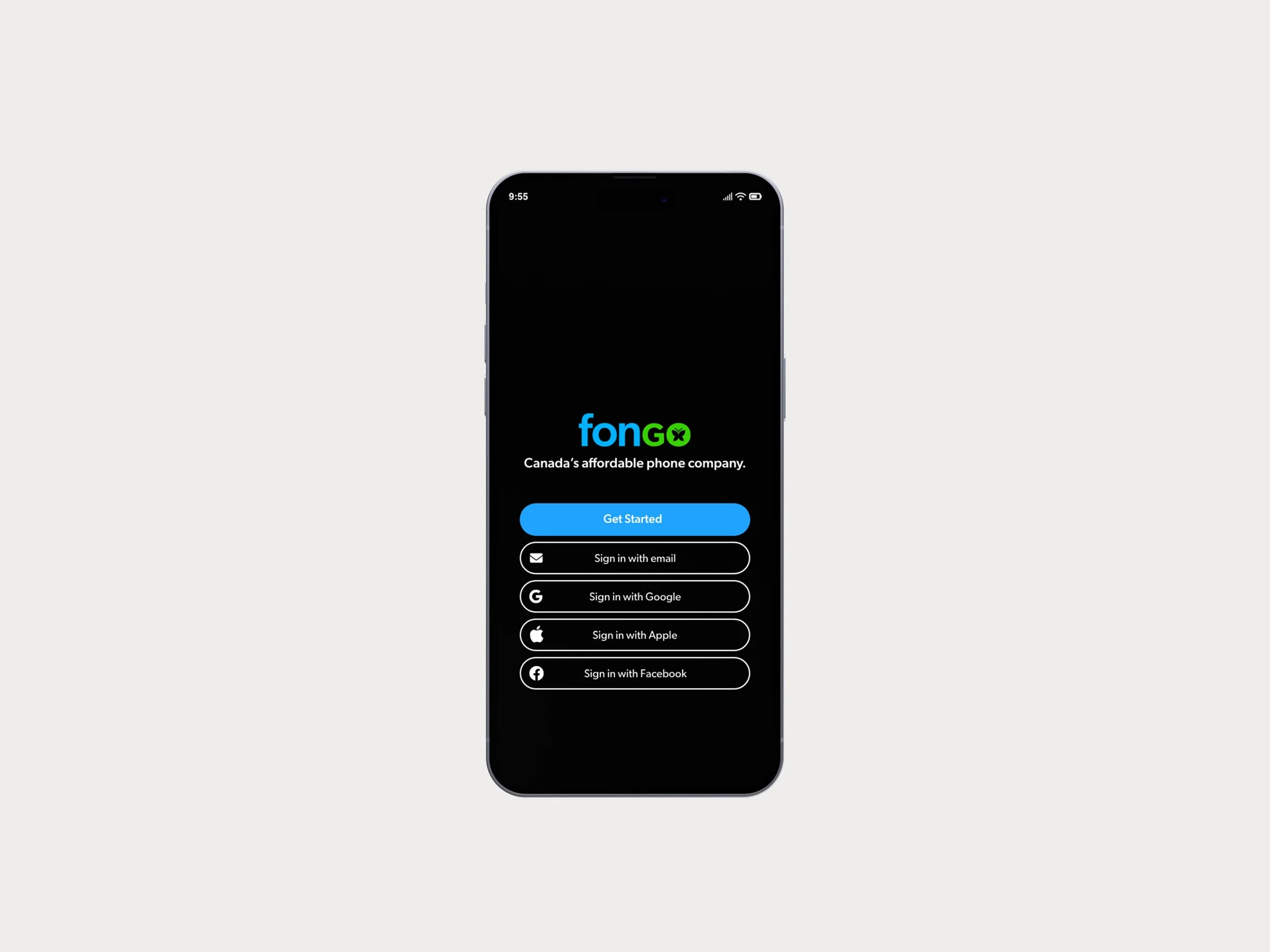
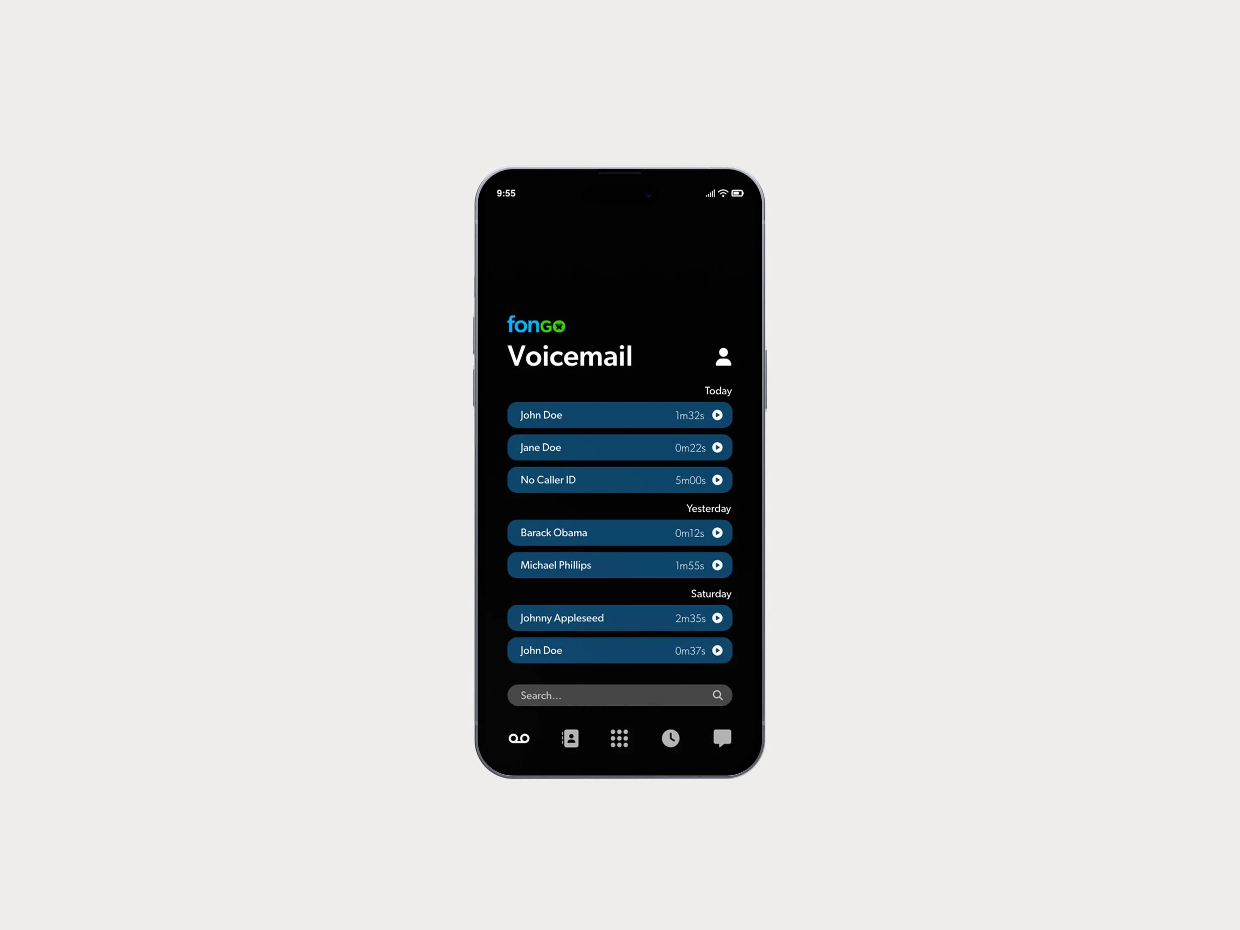
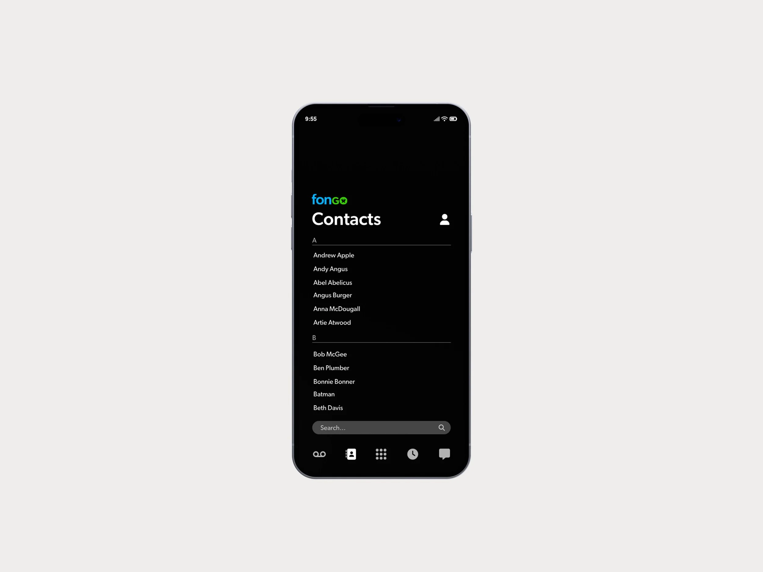
Brand Refresh and App UI redesign
Client
Corporate Design II
Problem
The existing brand identity and app design for Fongo, a telecommunications provider in Canada, is outdated and unappealing.
Target Audience
The target audience for Fongo is adults of any age looking for an affordable, internet-based alternative to Canada’s expensive telecommunications providers.
Solution
The Fongo brand identity and app UI needed to be refreshed, not completely overhauled. Therefore, the logo maintains its butterfly motif and colours but obtains a new, modern typeface. The UI design is fresh yet familiar, with a muted, friendly appearance aided by rounded buttons and an overall minimal aesthetic.